B.A.M Ticketing
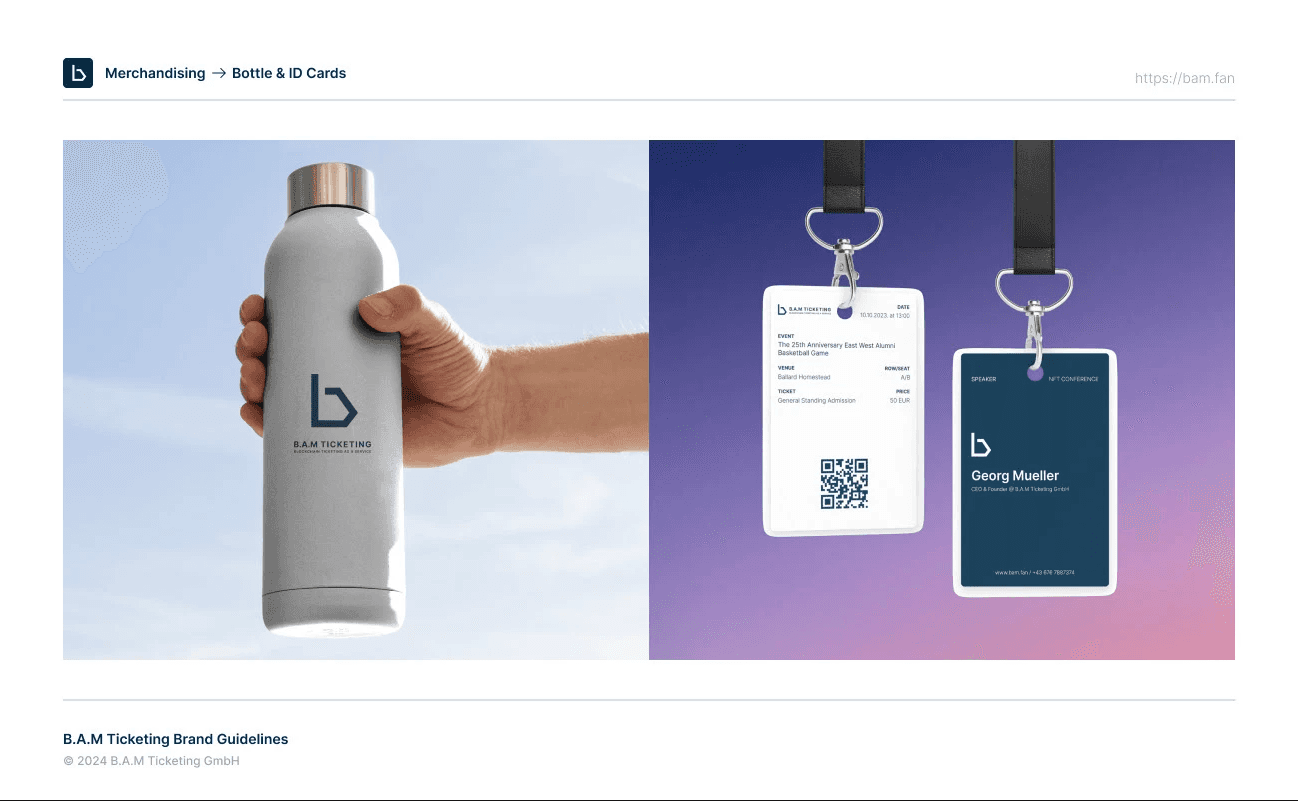
A comprehensive brand toolkit for B.A.M Ticketing that includes logo standards, color systems, typography rules, and design applications — designed to unify visual communication and strengthen brand recognition.

problem
Many ticketing brands struggle with inconsistent visual identities that dilute recognition and fail to clearly communicate the experience, values, and personality of the service. Without a cohesive brand system, marketing materials, user touch points, and promotional assets can feel disjointed, confusing potential customers and weakening brand trust.
solution
The B.A.M Ticketing Brand Guidelines establish a unified visual language and strategic framework that ensures consistency across all platforms and media. This includes clear rules for logo usage, typography, color palettes, iconography, layouts, and voice — enabling the brand to present a recognizable, professional, and memorable identity that resonates with users and partners.
B.A.M Ticketing’s branding initiative started with defining the core purpose and personality of the service: what it stands for, how it speaks to customers, and what visual tone best reflects its values. Through research and creative iteration, a brand system was crafted that balances flexibility with structure — giving designers and marketers a toolkit that’s both expressive and disciplined. The final guidelines not only standardize visual elements but also articulate how the brand behaves in real-world contexts, helping ensure a consistent experience whether in digital interfaces, printed tickets, signage, or social communications.
see also


